Dashboards as code means a dashboard is a file in a git repository, a declaration of which metrics it shows, how they are charted, and how they can be filtered, that is reviewed in a pull request and deployed on merge, instead of an object assembled by clicking in a BI tool and stored in its database. It is the last piece of the pipelines-as-code idea: if the loads, the models, the checks, and the metric definitions are already code, the thing people look at should be too. Bruin implements it as DAC, a dashboards-as-code tool where a dashboard is a YAML or TSX file on a built-in semantic layer, which the AI analyst can generate from a prompt; Lightdash, Evidence, Rill, and Looker are the other tools built on the same idea.
What is in the file
A dashboard definition is small, because the hard parts live elsewhere: the metric is defined in the semantic layer and the data in the pipeline. What remains is the presentation.
# dashboards/revenue.yml
name: Revenue overview
connection: warehouse

rows:
  - widgets:
      - name: Revenue
        type: metric
        sql: SELECT SUM(amount) AS value FROM mart.orders
        value:
          field: value
          type: number
          format: "$,.2f"
        col: 4
      - name: Revenue by week
        type: line
        sql: SELECT DATE_TRUNC('week', ordered_at) AS week, SUM(amount) AS revenue
             FROM mart.orders GROUP BY 1 ORDER BY 1
        col: 8
That is Bruin DAC, the dashboards-as-code tool in the Bruin platform: a rows and widgets layout, a chart type per widget, and the SQL or the semantic-layer metric that feeds it. The SQL above is the simplest form. With metrics and dimensions defined once in the project's semantic/ directory, a widget references the metric instead and DAC generates the SQL, so this dashboard, the Slack answer, and the finance report all use the same definition of revenue. A change to the metric is a change to one file, reviewed once, reflected everywhere. dac validate catches a broken query or a missing column before it is served, and dac serve renders the dashboard. The definitional side is in what is a semantic layer and the walk-through is on dashboards as code.
Why teams switch
| Clicked dashboards | Dashboards as code |
|---|---|
| A changed metric definition is discovered when the numbers disagree | The change is a diff in a pull request |
| Each dashboard embeds its own SQL, so revenue drifts across them | Metrics come from the semantic layer, defined once |
| A broken edit is rebuilt from memory | A broken edit is a git revert |
| Copying a dashboard to a new team means rebuilding it | Copy the file and change the filters |
| Documentation is a wiki page nobody updates | The file is the documentation |
| An AI agent can describe what to build | An AI agent can build, test, and open a pull request |
The last row is why the pattern matters more in 2026 than it did in 2020. An agent that generates a dashboard as a file is producing something reviewable, on governed metrics, that a human approves before it reaches the team. An agent that generates a dashboard object inside a BI application is producing something that has to be inspected by hand.
The AI angle
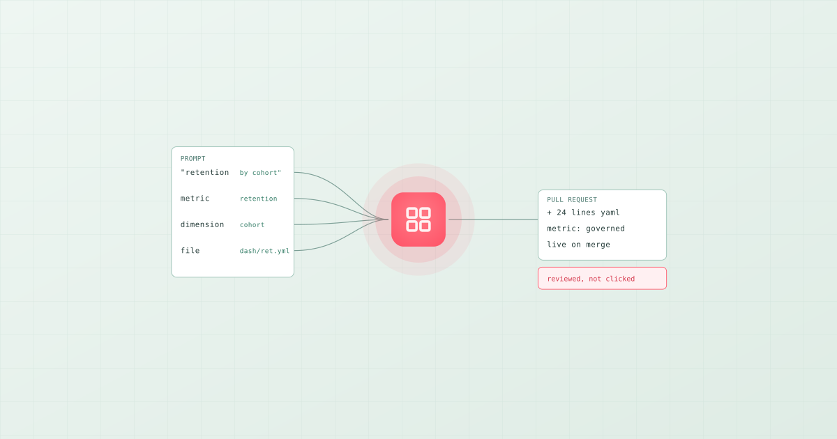
In Bruin the prompt "make me a dashboard for weekly retention by cohort" produces a DAC dashboard file whose widgets reference the semantic layer's retention metric and cohort dimension. Retention means what the company said it means, because the analyst compiled the definition rather than inventing SQL. The file goes into the repository, the pull request shows exactly what was added, and the dashboard is live on merge. That is the "build" step in the answer, build, act model of an AI data analyst, and it is only possible because the dashboard is code.
How the tools compare
- Bruin DAC: dashboards in YAML or TSX with 17+ chart types, filters, tabs, and loops, on a built-in semantic layer, in the same repository as the pipeline and the checks; validated with
dac validate, served withdac serve; generated from a prompt by the AI analyst or written by hand. The hands-on course is Dashboards as Code with Bruin DAC. - Lightdash: charts and dashboards as YAML beside a dbt project, with the metrics from dbt's model files. Open source, MIT-style licence.
- Evidence: reports written in Markdown with SQL blocks, built to a static site. Good for narrative reports, less for interactive filtering.
- Rill: YAML dashboards on DuckDB or ClickHouse, fast for exploration, its own metrics layer.
- Looker: LookML defined the category; dashboards as LookML files on a Looker model. Enterprise pricing.
- Streamlit and Hex: code, but applications rather than declarations. Useful for a bespoke data app; more to maintain than a dashboard file. That distinction is the subject of what is a data app.
The tool comparison for AI-generated dashboards is in the best AI dashboard tools in 2026.