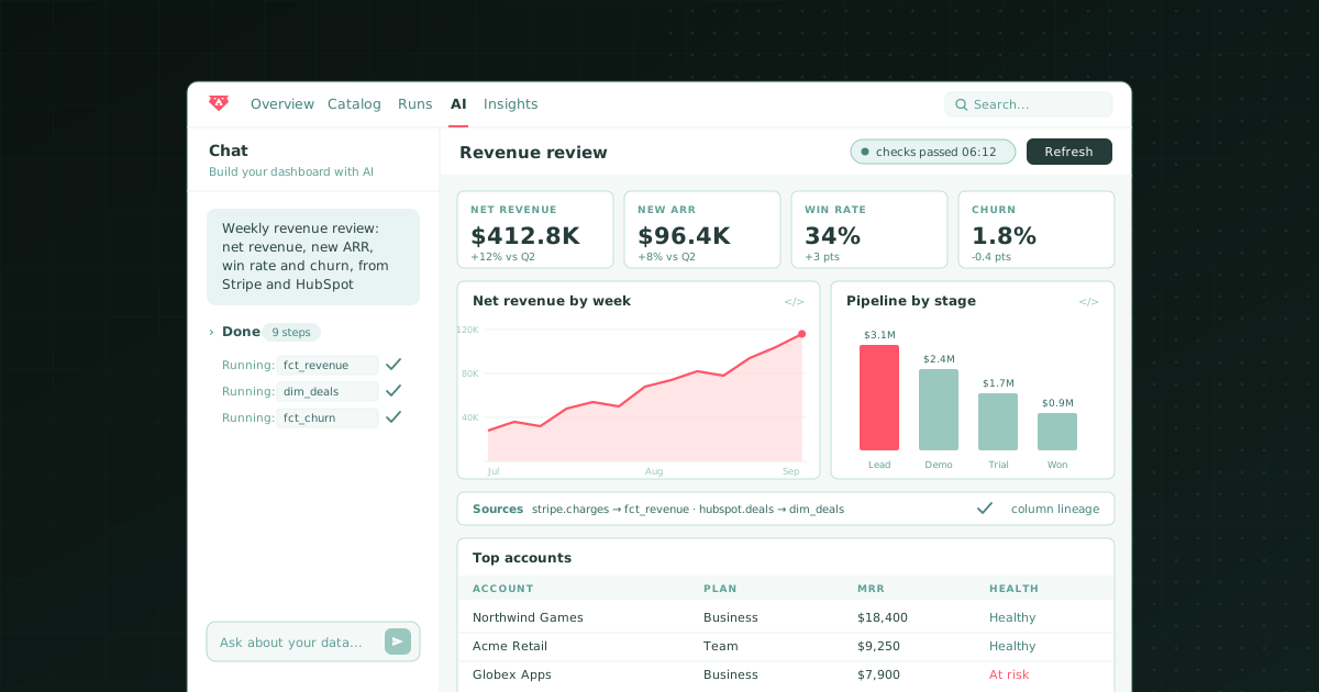
Claude Dashboards and Bruin both turn a question into a live dashboard, and they disagree about where the work starts. Claude Dashboards, which Anthropic released in beta on 8 October 2026, starts at the warehouse: connect Snowflake, BigQuery, Databricks, Redshift, or ClickHouse, ask in plain language, and Claude writes and runs a SQL query for each chart. Bruin starts at the sources: it loads them, models them, checks them, and then its agent builds the dashboard on that governed data. If your warehouse is already modelled and tested, Claude is a fast way to get a chart. If the dashboard is one your team reviews every week, the question is who stands behind the number, and that is the job Bruin was built for.
We build Bruin and we use Claude every day, so this is a comparison from people who like both. For the page-length version with the full feature matrix, see Claude Dashboards vs Bruin.
What Claude Dashboards actually does
Claude Dashboards is a template for Claude artifacts, the interactive pages Claude publishes on claude.ai. You start from a chat ("build a dashboard of this quarter's revenue by region") or from the Dashboards template in the Artifacts tab, and Claude does four things:
- Writes a SQL query per chart and runs it against the connected source.
- Shows its work on every chart: the query behind it and when its data was last refreshed. Click any number to see the query, or ask Claude to explain it.
- Keeps the dashboard current as the data changes, according to Anthropic. Live queries run through each viewer's own connector, so viewers see what their own access allows.
- Hands off to a BI tool when you need more. Anthropic lists Amplitude, Grafana, Hex, Mixpanel, Omni, Perplexity, PostHog, and Sigma as export destinations, with Databricks Genie, Looker, monday.com, and Tableau coming soon.
It is in beta on Pro, Max, Team, and Enterprise, it counts toward your plan's usage limits, and on Enterprise an owner has to switch it on. Anthropic's own help article says dashboards are "designed for quick, exploratory questions" and points deeper analysis elsewhere. That framing is honest, and it is the key to the comparison.
What Bruin AI dashboards do
Bruin dashboards live in Bruin Cloud under AI → Dashboards. You pick an agent, describe what you want, and the agent runs the SQL, chooses the widgets (charts, metrics, tables, pivot tables, text), and lays them out on a grid. You keep chatting to change it, then publish when it looks right. Viewers can chat with it in their own private threads.
The difference is what the agent stands on. The same Bruin project that the dashboard reads from also:
- Loads the data with ingestr, from databases, warehouses, files, and business tools such as Stripe and HubSpot, plus thousands of sources via API, webhooks, and scraping.
- Models it in SQL and Python assets that run on a schedule.
- Checks it with quality checks declared on the asset that builds each table. A failed check stops the run.
- Traces it with column-level lineage derived from the SQL Bruin runs.
- Defines it once in semantic and named queries that every dashboard reuses, with team notes attached to the data.
And if you would rather keep dashboards in your repository, Bruin's open-source dac turns a YAML or TSX file into a live dashboard on your warehouse, reviewed in a pull request like the rest of the pipeline.
Side by side
| Bruin AI dashboards | Claude Dashboards | |
|---|---|---|
| Starts from | Your sources: loads, models, and checks them | Your warehouse or connected app, as it is |
| Data sources | Snowflake, BigQuery, Databricks, Redshift, ClickHouse, Postgres, DuckDB, and more, fed by direct integrations plus thousands via API | Redshift, BigQuery, ClickHouse, Databricks, Snowflake, Salesforce, and other connected apps |
| Loads and transforms data | Yes | No |
| Quality checks before the chart | Yes, in the pipeline | No; you read each chart's query |
| Metric definitions | Shared semantic and named queries | SQL written per chart |
| Lineage | Column-level, to the source column | The query behind each chart |
| Version control | Draft and publish in Bruin Cloud; dac files in pull requests | Versions on claude.ai |
| Sharing | Private or team, viewer and editor roles | Private, organization, or public link if an admin allows |
| Also answers in chat | Slack, Microsoft Teams, Google Chat, WhatsApp, Discord, Telegram, email, browser | claude.ai web, desktop, mobile |
| Status | Available in Bruin Cloud; dac open source | Beta since 8 October 2026 |
| Price | Free open-source core; cloud plans | Paid Claude plans; counts toward usage limits |
Where Claude Dashboards is the right call
Claude Dashboards is very good at the thing it was designed for. If a data team already runs a clean, tested warehouse, a product manager can ask "compare this week's signups with last month's" and have a working dashboard before the meeting starts. Every chart says what it counted, so anyone who reads SQL can check it in seconds. Live queries respect each viewer's own warehouse permissions. And the same Claude that built the chart can explain a spike, draft the summary, or open the follow-up ticket, which no single-purpose dashboard tool does.
For one-off questions on good data, that is hard to beat, and we would not tell you to use anything else.
Where it stops for team dashboards
The limits are not about the model. Claude writes good SQL. They are about what sits under the query.
It queries, it does not build. Claude Dashboards reads tables that already exist. If your revenue lives in Stripe, your pipeline in HubSpot, and your product data in a Postgres replica, someone still has to load and model those into a warehouse before Claude has anything trustworthy to chart. For most companies under a few hundred people, that someone is the bottleneck. Bruin does that part.
A failed load looks like a quiet day. If last night's orders load failed, the dashboard reruns its queries, shows a fresh refresh time, and charts yesterday's rows as if they were today's. Nothing between the warehouse and the chart knows the load failed. Bruin's checks run inside the pipeline that builds each table, including freshness checks, so the dashboard can say the table failed instead of drawing a dip.
Every dashboard writes its own SQL. Claude writes a query per chart, per dashboard. Two people who ask for "active customers" can get two different filters and two different numbers, both explained clearly. That is fine for exploration and painful for a weekly review. Bruin dashboards read shared semantic and named queries, so the definition is written once and every dashboard inherits it.
Verification is on the reader. "Open the query and check what it counts" is good advice, and it is Anthropic's advice. It also means the person who can check is the person who reads SQL, and that person is usually busy. Bruin shows the SQL too, plus the lineage back to the source column and whether the tables behind the widget passed their checks.
It lives on claude.ai. A Claude dashboard is an artifact with versions on claude.ai, not a file in your repository, so it does not go through the review and deploy process the rest of your data work does. Bruin's dac dashboards are files you review in a pull request.
Where Bruin stops
Bruin is a data platform with an AI layer on top, not a general assistant. It will not draft your board memo from a dozen Google Docs, write the follow-up email, or reason across everything else Claude can reach. It also asks more of you up front: to get dashboards on governed data, you connect your sources and let Bruin build the pipeline, which is real work the first time even with the CLI and templates. If all you need is a chart on a warehouse that a data team already keeps clean, Claude Dashboards gets you there with less setup.
The setup we would recommend
Use both, with a clear line between them. Let Bruin load, model, and check the tables in your Snowflake, BigQuery, or Databricks account, and keep recurring team dashboards, scheduled reports, and chat answers in Slack or Teams on Bruin, where the definitions live. Then connect Claude to that same warehouse so anyone can spin up a quick Claude dashboard on tables that have already passed their checks. Claude gets better data, and your weekly numbers stay in one governed place.
Best tool by need
- A quick dashboard for a one-off question on a warehouse that is already modelled and tested: Claude Dashboards.
- Recurring team dashboards on data that is loaded, modelled, checked, and traced in one platform: Bruin.
- Dashboards reviewed as code in your own repository: Bruin (dac).
- The same numbers in Slack, Microsoft Teams, Google Chat, or WhatsApp as on the dashboard: Bruin.
- Notebook-style deep analysis after a quick look: Hex, one of Claude's export destinations.
- A full BI tool on a modelled warehouse: Sigma or Omni, both Claude export destinations.
The bottom line
Claude Dashboards settles the argument that anyone can get a dashboard by asking for one. What it does not settle is whether the number on that dashboard is right, and Anthropic is careful not to claim it does. That part depends on the pipeline underneath: the loads, the models, the checks, and one definition of each metric. Bruin owns that pipeline and builds dashboards on top of it. For more on the trade-off, read can Claude Dashboards replace your BI tool? and the best Claude Dashboards alternatives in 2026.